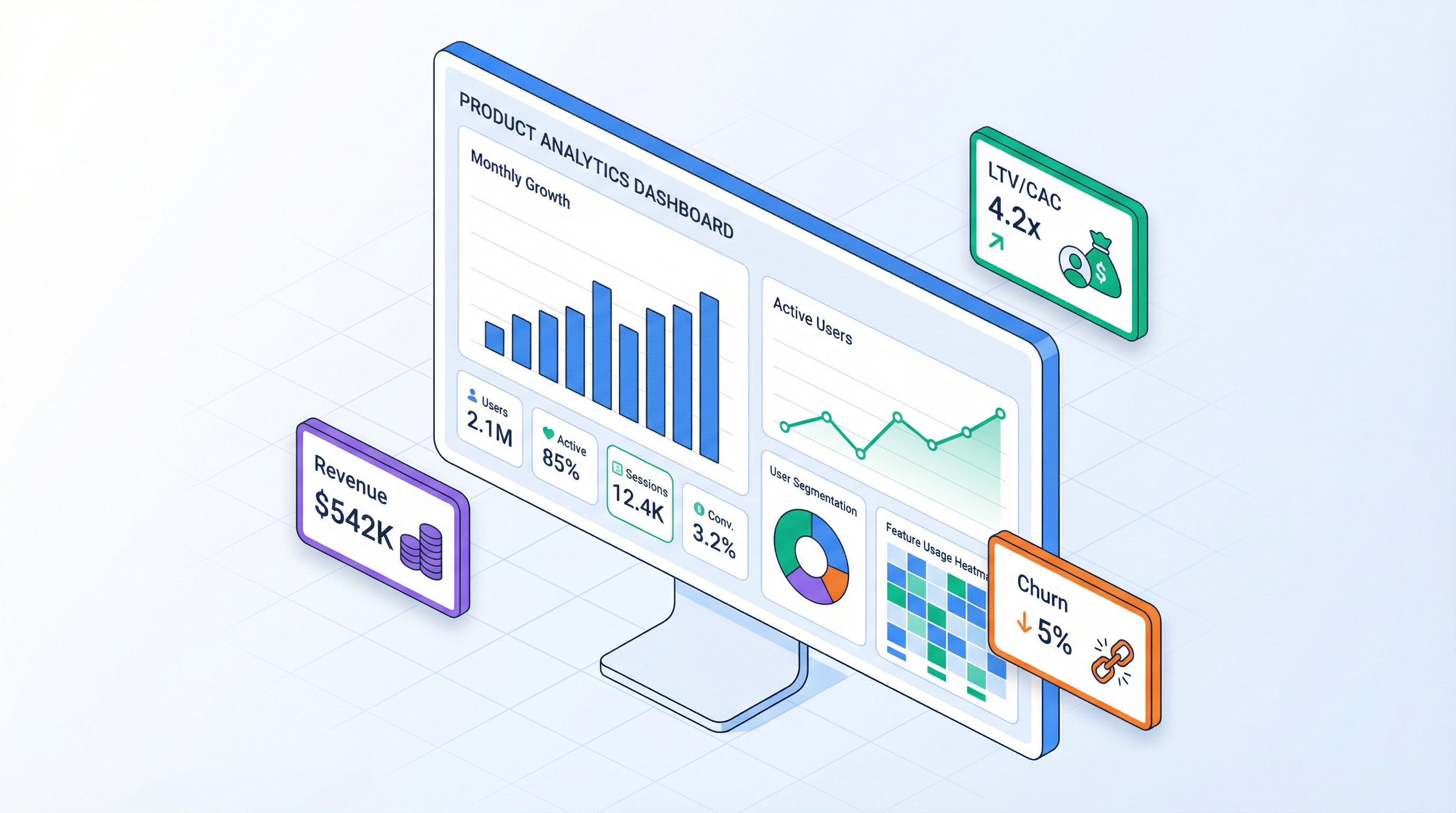
Product Manager Dashboard: 25 Metrics You Should Always Have in Front of You
Over eight years in product development, I've seen hundreds of dashboards. And here's the pattern: the more metrics on screen, the fewer decisions the team makes. A dashboard with 50 charts isn't a control panel — it's a museum. The team walks in, admires the exhibits, and walks out. Nothing changes.
A good dashboard answers not "what happened?" but "what should we do?" This article covers 25 metrics every product manager should have in front of them, and the principles that turn them into a decision-making tool.
A Dashboard Is a Control Panel, Not a Report
The difference between a report and a dashboard is like the difference between an X-ray and a car's instrument panel. An X-ray shows what already happened. An instrument panel shows what's happening right now and what action is needed.
Three signs of a working dashboard:
1. Every metric leads to action. If a metric drops, you know what to investigate. If it rises, you know what to scale. If a metric leads to nothing — it doesn't belong on the dashboard.
2. Hierarchy from general to specific. First glance — business health (Revenue, Burn Rate, Runway). Second — what drives key metrics (CAC, Churn, ARPU). Third — diagnostics (by channel, cohort, segment).
3. Threshold values. A metric without context is useless. Is 5% churn good or bad? Depends on the benchmark, last month, and target. The dashboard should show not just a number, but its relationship to the norm.
The principle I use: if you can't tell whether things are OK in 5 seconds — the dashboard doesn't work.
5 Metric Categories for a Product Dashboard
Category 1 — Financial
Metrics that show whether the business is alive or dying. Product managers aren't finance people, but without these numbers they're making decisions blind.
Revenue — total income for the period. Trend matters more than absolute value: growing, stagnating, or declining?
MRR (Monthly Recurring Revenue) — for subscription models. Shows predictable income.
Four MRR components are four levers. New MRR grows through acquisition, Expansion through upsell, Churned drops through retention, Contraction through pricing policy.
Burn Rate — how much cash the company spends per month beyond revenue.
If Burn Rate is positive (spending more than earning), the next metric is Runway.
Runway — how many months the company survives at the current burn rate.
Red zone: under 6 months. Yellow: 6-12. Green: 12+. With Runway < 6 months, every other metric becomes secondary — you need to either cut expenses or raise a round.
Net Income — the bottom line of the P&L model.
Category 2 — Acquisition
Metrics that answer: "where are customers coming from and what does it cost?"
CAC (Customer Acquisition Cost) — cost to acquire one customer. Calculated per channel, not as a blended average.
Channel ROI — return on investment per channel.
A channel with ROI < 100% is unprofitable. 200-300% is healthy. Above 500% — either the channel is underinvested or the data is unreliable. For more on calculating ROI with channel lifecycle considerations, see the marketing channel article.
Conversion Funnel — conversion at each stage: Reach -> Click -> Install -> Activation -> Payment.
| Stage | Count | Conversion |
|---|---|---|
| Reach | 100,000 | — |
| Click | 3,000 | 3.0% |
| Install / Sign-up | 450 | 15.0% |
| Activation (trial) | 225 | 50.0% |
| Payment | 45 | 20.0% |
Every stage is a loss point. Improving conversion at one stage by 1% can deliver more than doubling the Reach budget.
New Users/Month — absolute count of new paying users. In a time series. The trend shows whether the funnel is growing.
Category 3 — Retention
Retention is the foundation of sustainable growth. Acquisition without retention is pouring water into a leaky bucket.
Retention Rate — the share of users who remain active after N months.
Churn Rate — the flip side: share of those who left.
Benchmarks: SaaS B2B — 3-5%/mo (good), 5-7% (average), >7% (problem). B2C mobile apps — 10-15%/mo is considered normal, <10% is excellent.
Cohort Heatmap — the essential tool for retention analysis. It shows each cohort's retention by month. Without cohort analysis, average churn masks the real picture: newer cohorts might be leaving faster than older ones, and you'd never notice. Detailed breakdown in the cohort analysis article.
| Cohort | M0 | M1 | M2 | M3 | M6 | M12 |
|---|---|---|---|---|---|---|
| Jan 2026 | 100% | 68% | 52% | 45% | 32% | 22% |
| Feb 2026 | 100% | 72% | 58% | 50% | 38% | — |
| Mar 2026 | 100% | 75% | 62% | 55% | — | — |
Upward trend: each new cohort retains better. This signals product improvement. Downward trend — alarm bell.
DAU/MAU Ratio — daily to monthly active users. Shows product "stickiness."
Benchmarks: >25% is excellent (Facebook-level), 15-25% is good, <10% means the product is used but not daily (normal for B2B analytics).
Category 4 — Monetization
Metrics that show how effectively you convert users into revenue.
ARPU (Average Revenue Per User) — average revenue per user per month.
Important: calculate ARPU by segment. An average ARPU of 20 and 20% at $170. Those are two different products.
LTV (Lifetime Value) — how much one customer generates over their lifetime.
Or more precisely, with discounting:
LTV/CAC — the key unit economics ratio. Shows whether acquisition pays for itself.
| LTV/CAC | Interpretation | Action |
|---|---|---|
| < 1x | Losing money per customer | Urgent: cut CAC or increase LTV |
| 1-3x | Barely breaking even | Optimize: channels, pricing, retention |
| 3-5x | Healthy economics | Scale, invest in growth |
| > 5x | Underinvesting in growth | Increase acquisition budget |
Payback Period — how many months until acquisition cost is recouped.
Target: <12 months for SaaS, <6 for transactional models. Payback > 18 months is serious risk — the customer might churn before you recoup the investment.
Contribution Margin — marginal profitability of each additional customer.
For SaaS, CM% is typically 85-95%. Below 70% — the model doesn't scale.
Category 5 — Investment
Metrics for investors and strategic decisions. Product managers don't check these daily, but should understand and monitor them.
NPV (Net Present Value) — present value of all future cash flows.
NPV > 0 means the project creates value. NPV < 0 means it destroys value. Detailed breakdown of NPV, IRR, and DPP in the investment metrics article.
IRR (Internal Rate of Return) — the discount rate at which NPV = 0. Shows project profitability.
DPP (Discounted Payback Period) — months until the project recoups initial investment, accounting for the time value of money.
Break-even Month — the month when monthly revenue first covers all expenses.
Cash Runway — at the current burn rate, how many months until the bank account hits zero. Differs from Runway by using the current (potentially volatile) burn rate, not the average.
25 Widgets: What Each One Shows
Full Widget Map
| # | Widget | Category | What It Shows | When to React |
|---|---|---|---|---|
| 1 | Revenue Total | Financial | Total revenue by month | Decline for 2+ consecutive months |
| 2 | MRR Breakdown | Financial | New + Expansion - Churn - Contraction | Churned MRR > New MRR |
| 3 | Burn Rate | Financial | Monthly net expenses | Growing while Revenue stagnates |
| 4 | Runway | Financial | Months until zero cash | < 6 months |
| 5 | Net Income | Financial | Net profit/loss | Worsening trend |
| 6 | CAC by Channel | Acquisition | Acquisition cost per channel | CAC > LTV/3 |
| 7 | Channel ROI | Acquisition | Return per channel | ROI < 100% |
| 8 | Conversion Funnel | Acquisition | Drop-off at each stage | Sharp conversion decline |
| 9 | New Users Trend | Acquisition | New customer dynamics | Unexplained decline |
| 10 | Acquisition Cost | Acquisition | Total spend on acquisition | Growing with flat volume |
| 11 | Retention Curve | Retention | Retention by month | Curve shifting downward |
| 12 | Churn Rate | Retention | % churned per period | Growth > 1% per quarter |
| 13 | Cohort Heatmap | Retention | Retention by cohort | New cohorts worse than old |
| 14 | DAU/MAU | Retention | Product stickiness | Drop below 15% |
| 15 | Active Users | Retention | Total active count | Stagnation despite growing inflow |
| 16 | ARPU | Monetization | Average revenue per user | Declining as base grows |
| 17 | LTV | Monetization | Customer lifetime value | Falling below 3x CAC |
| 18 | LTV/CAC | Monetization | Key ratio | < 3x |
| 19 | Payback Period | Monetization | Acquisition recoup time | > 12 months |
| 20 | Contribution Margin | Monetization | Per-customer profitability | < 70% |
| 21 | NPV | Investment | Present value of project | NPV < 0 |
| 22 | IRR | Investment | Internal rate of return | IRR < discount rate |
| 23 | DPP | Investment | Investment payback | > 36 months |
| 24 | Break-even | Investment | Month of first profit | Keeps shifting right |
| 25 | Cash Runway | Investment | Current cash buffer | < 6 months |
Waterfall Chart: Where Profit Comes From and Where It Goes
The waterfall diagram is my favorite widget for understanding P&L structure. It shows how Revenue becomes Net Income through a chain of income and expense items.
Reading example: Revenue 10K -> Gross Profit 25K -> Marketing -4K -> Net Income $3K.
When to react: if one of the "steps" grew disproportionately. Marketing went from 15% to 30% of Revenue — investigate: is this a growth investment or inefficiency?
Profitability Chart: When Break-Even Happens
Two lines on the same axis: cumulative revenue and cumulative costs. The intersection point is break-even.
Key distinction: don't confuse monthly break-even (Revenue >= Costs in a specific month) with cumulative break-even (when total revenue covers all costs since inception). The first shows operational sustainability, the second shows return on investment.
Cohort Heatmap: Retention Health
A heatmap where rows are cohorts (acquisition month), columns are lifetime months, and color intensity represents retention%. Green (>50%), yellow (25-50%), red (<25%).
What to look for:
- Horizontal trend: how quickly a cohort "fades." If retention stabilizes at 20-30% after month 6 — that's your core, your loyal users.
- Vertical trend: are newer cohorts improving? Each subsequent row should be "greener" than the previous one. This signals a growing product.
- Anomalies: a sharp drop in a specific cohort. What happened that month? A bug? Onboarding change? Channel switch?
Scenario Comparison: Three Realities Side by Side
Three scenarios — pessimistic, base, optimistic — on one chart. Key metrics for each: Revenue, Active Users, Net Income, Break-even Month.
| Parameter | Pessimistic | Base | Optimistic |
|---|---|---|---|
| New Users/mo | 20 | 40 | 70 |
| Churn | 7% | 5% | 3% |
| ARPU | $45 | $55 | $65 |
| Break-even | Month 28 | Month 18 | Month 11 |
| 36-mo Revenue | $480K | $980K | $1.8M |
Scenarios show the range of outcomes. If even the optimistic scenario doesn't break even within 36 months — the model needs rethinking. If the pessimistic scenario still survives — the model is resilient.
Sankey Diagram: Cash Flow Visualization
A Sankey diagram shows where money comes from and where it goes. Flows are proportional to amounts. Left side — revenue sources (subscriptions, one-time payments, commissions). Right side — expense categories (team, marketing, infrastructure). In the center — Gross Profit as a distribution node.
One glance is enough: if the flow into "Marketing" is thicker than the flow from "New Subscriptions" — acquisition isn't paying for itself yet.
Principles of Effective Dashboard Design
The 5-Second Rule
In 5 seconds, the user should understand: are things OK or not? This means:
- Top row — 3-5 key cards (Revenue, Burn Rate, Runway, LTV/CAC, Active Users)
- Color indicators — green/yellow/red on each card
- Trend — up/down arrow and percentage change for the period
You don't need to analyze every chart in 5 seconds. You need to tell in 5 seconds whether deep analysis is required.
Hierarchy: From General to Specific
Three dashboard levels:
Level 1 — Health (5 cards): Revenue, Runway, Active Users, LTV/CAC, Net Income. Visible immediately, no scrolling.
Level 2 — Drivers (8-10 widgets): CAC by channel, Churn Rate, ARPU, Conversion Funnel, MRR Breakdown. Show what moves Level 1 metrics.
Level 3 — Diagnostics (10-12 widgets): Cohort Heatmap, Channel ROI, Scenario Comparison, Waterfall, Contribution Margin. Used for deep analysis when a problem is spotted at Level 1 or 2.
The user shouldn't see 25 widgets simultaneously. They see 5, expand to 10, dive into 25 — when needed.
Colors as Signals, Not Decoration
Three rules for color on dashboards:
1. Green = all clear. Metric within normal range. No attention required.
2. Yellow/orange = attention. Metric approaching threshold. Monitor closely.
3. Red = action. Metric beyond acceptable limits. React now.
Threshold values are set for each metric:
| Metric | Green | Yellow | Red |
|---|---|---|---|
| Churn (SaaS B2B) | <5% | 5-7% | >7% |
| LTV/CAC | >3x | 1-3x | <1x |
| Runway | >12 mo | 6-12 mo | <6 mo |
| Payback | <12 mo | 12-18 mo | >18 mo |
| Gross Margin | >70% | 50-70% | <50% |
Important: for charts, use a colorblind-safe palette. The red-green pair is invisible to 8% of men. Better options: blue + orange, or a single-color gradient.
Freshness: A Dashboard Lives When Data Is Fresh
A dashboard with month-old data is a museum exhibit. Update frequency depends on metric type:
| Metric Type | Update Frequency | Example |
|---|---|---|
| Operational | Daily | DAU, New Sign-ups |
| Financial | Weekly | Revenue, Burn Rate |
| Strategic | Monthly | LTV, Cohort Retention |
| Investment | Quarterly | NPV, IRR |
When modeling, the dashboard updates instantly when input parameters change. This is one of the key advantages over Excel: change churn from 5% to 7% — all 25 metrics recalculate in a second.
Anti-Patterns: How NOT to Build a Dashboard
50 Metrics on One Screen
The most common mistake. The team is afraid of missing something, so they add everything. Result: cognitive overload, nobody looks. The dashboard goes from tool to wallpaper.
Rule: if nobody checks a metric at least once a week — remove it from the dashboard. Let it live in reports.
Vanity Metrics Without Context
"We have 50,000 users!" — vanity metric. Without context, it's useless.
| Vanity Metric | Why It's Useless | What to Track Instead |
|---|---|---|
| Total Users (all time) | Includes long-gone users | Active Users (MAU) |
| Cumulative Revenue | Always grows, masks decline | MRR + trend |
| Page Views | Not tied to business outcomes | Conversion Rate |
| App Downloads | Not equal to active users | Activation Rate |
| NPS Score | Average hides distribution | Retention by Cohort |
A cumulative chart always goes up. Even if the business is dying. This is the most dangerous chart type: it creates a false sense of growth. Always show periodic metrics (per month, per week), not cumulative.
Metrics Without Thresholds
Churn 4.8%. Is that good? Bad? Normal? Without a threshold value, a metric is just a number. It doesn't help make decisions.
Every metric on the dashboard should have:
- Target — the goal
- Threshold — the level that triggers a response
- Direction — which way is "good" (higher/lower)
Pretty Charts With No Practical Value
3D charts, pie charts with 15 segments, animated transitions. Beautiful in a presentation, useless for decision-making.
Rule: if understanding a chart takes more than 3 seconds — replace it with a table or simple bar chart.
From Dashboard to Action: Decision Framework
A dashboard is only as valuable as the actions it drives. Here's a decision-making framework based on metrics:
Scenario 1: Churn Increased 3% Over One Quarter
Detection: Churn Rate card at Level 1 — red.
Diagnosis (Level 3):
- Open Cohort Heatmap — which cohorts are leaving faster?
- Check by channel — could the problem be one acquisition channel (attracting the wrong users)?
- Check by tier — are cheap or expensive customers leaving?
Decision:
- New cohorts churning (months 1-3) — onboarding or expectations problem. Action: overhaul onboarding, check if marketing promises match reality.
- Old cohorts churning (months 6-12) — product value problem. Action: interview churned users, analyze feature usage.
- Churn concentrated in one channel — the channel attracts non-target audience. Action: turn off the channel or change targeting.
Scenario 2: CAC Doubled in 2 Months
Detection: CAC card — yellow turning red.
Diagnosis:
- Channel ROI — which channel got more expensive?
- Conversion Funnel — where did conversion drop?
- ARPU — if it grew in parallel, could there be a segment shift?
Decision:
- Conversion dropped at Click -> Install — creative or landing page problem. Action: A/B test, update landing page.
- Conversion stable, but cost-per-click increased — channel competition. Action: redistribute budget to less competitive channels, invest in organic.
- CAC grew, but ARPU grew more — migration to a more expensive segment. Action: check LTV/CAC — if > 3x, this isn't a problem, it's evolution.
Scenario 3: Revenue Growing, Net Income Falling
Detection: Revenue — green, Net Income — red.
Diagnosis:
- Waterfall Chart — which expense line grew disproportionately?
- Contribution Margin — is per-customer profitability declining?
- Burn Rate — expense trend?
Decision:
- Payroll grew faster than Revenue — hired ahead of growth. Action: check if there's a plan for the hires to pay off in 3-6 months. If not — freeze hiring.
- Marketing grew, but New Users didn't — declining channel efficiency. Action: audit channels, cut underperformers.
- COGS grew — infrastructure scaling more expensively than expected. Action: optimize architecture, review providers.
Wrapping Up
A product manager's dashboard isn't a metric showcase or a management report. It's a tool that every morning answers one question: "what should I do today?"
-
25 metrics, not 25 screens. A three-level hierarchy: 5 key cards -> 10 drivers -> 10 diagnostic widgets. Level 1 is always visible, the rest are on demand.
-
Every metric leads to action. Churn rose -> check cohorts -> find the problem -> make a decision. If a metric doesn't lead to a decision, it doesn't belong on the dashboard.
-
Thresholds, not numbers. Churn 4.8% without a threshold is noise. Churn 4.8% with a 5% threshold and a 3% target is a clear signal: we're in the yellow zone.
-
Vanity metrics do harm. Cumulative charts, total users, NPS without context create growth illusions. Use periodic metrics and segment by cohort.
-
The dashboard must live. Stale data is worse than no data. If the model doesn't update when parameters change — it's not a dashboard, it's a screenshot.
ProductWave's dashboard includes 31 widgets with drag-and-drop layout: from Revenue Waterfall to Cohort Heatmap and Scenario Comparison. Widgets recalculate instantly when any model parameter changes, support presentation mode, and export to PDF/JPG. Try building your own dashboard on the free tier and check whether it answers "what to do?" in 5 seconds.
March 20, 2026
DashboardProduct ManagementAnalyticsGuide